Corona in Charts is a simple web app which tracks the Corona pandemic (Covid-19) for each country. The data about the Corona pandemic is collected through the pomber’s covid19 API which provides time-series of coronavirus cases (confirmed, deaths and recovered) per country and is updated daily. The API relies on Johns Hopkins University (JHU CSSE) data. The Corona in Charts app still has some small bugs and thus it’s recommended that you compare its data with other sources. For data for United States of America, search for US in the app. The app is deployed via Netlify.
Charts
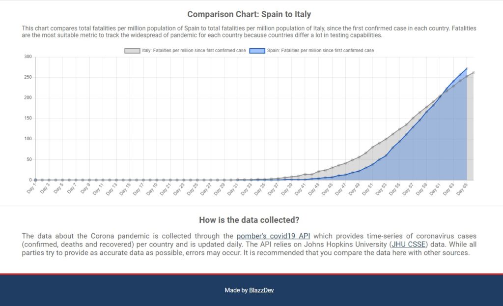
The app displays the following charts for whichever country you choose:
- Total cases
- New cases per day
- Active cases
- Increase/decrease in active cases per day
- Total recovered
- New recovered per day
- Total fatalities
- New fatalities per day
- Comparison chart
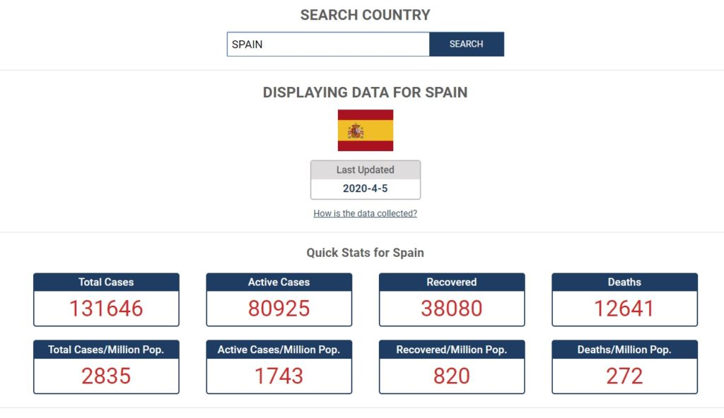
Other data:
- Total cases
- Active cases
- Recovered
- Deaths
- Total cases per million population
- Active cases per million population
- Recovered per million population
- Deaths per million population
Images


